
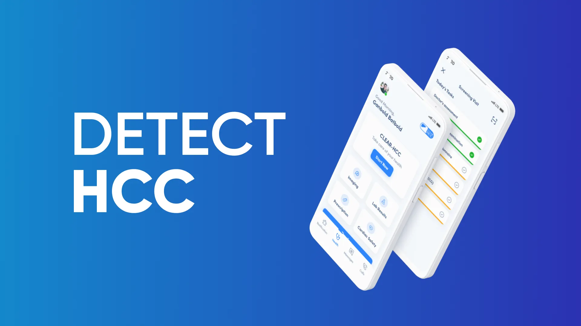
Detect - HCC App UI/UX Design
Associated with

Since 2014, I have been determined to become a Software Engineer and began developing my own projects. Coding becomes easier once the core concepts and logic are understood, but without proper UI, even the best code cannot create a complete product. In 2021, I decided to challenge myself by taking on the role of a UI/UX Designer while studying at university and living in a dorm in Moscow.
There were many job postings for UI/UX Designer roles, as Mongolian companies had begun to recognize the importance of design. I applied to a medical research company called Onom Foundation and was accepted. This was where I began to study User Interface and User Experience more deeply and separately.
Our project was a medical application for patients, designed with essential features to support their screenings. Its main goals were to remind patients to take their medicines on time, provide checklists for screening procedures, enable chat and appointment booking with specific doctors, and deliver lab test results directly to their phones. To design effectively, I had to put myself in the patient’s position and consider what I would need most if I were in their place. This was where I began to develop empathy in my design approach.
It was not as easy as it seemed. I spent weeks first prototyping on paper and then creating low-fidelity designs in Figma. Although the app was designed for all users, it was primarily intended for elderly patients. This meant the UI had to be as simple and intuitive as possible, allowing anyone to use the app almost instinctively.
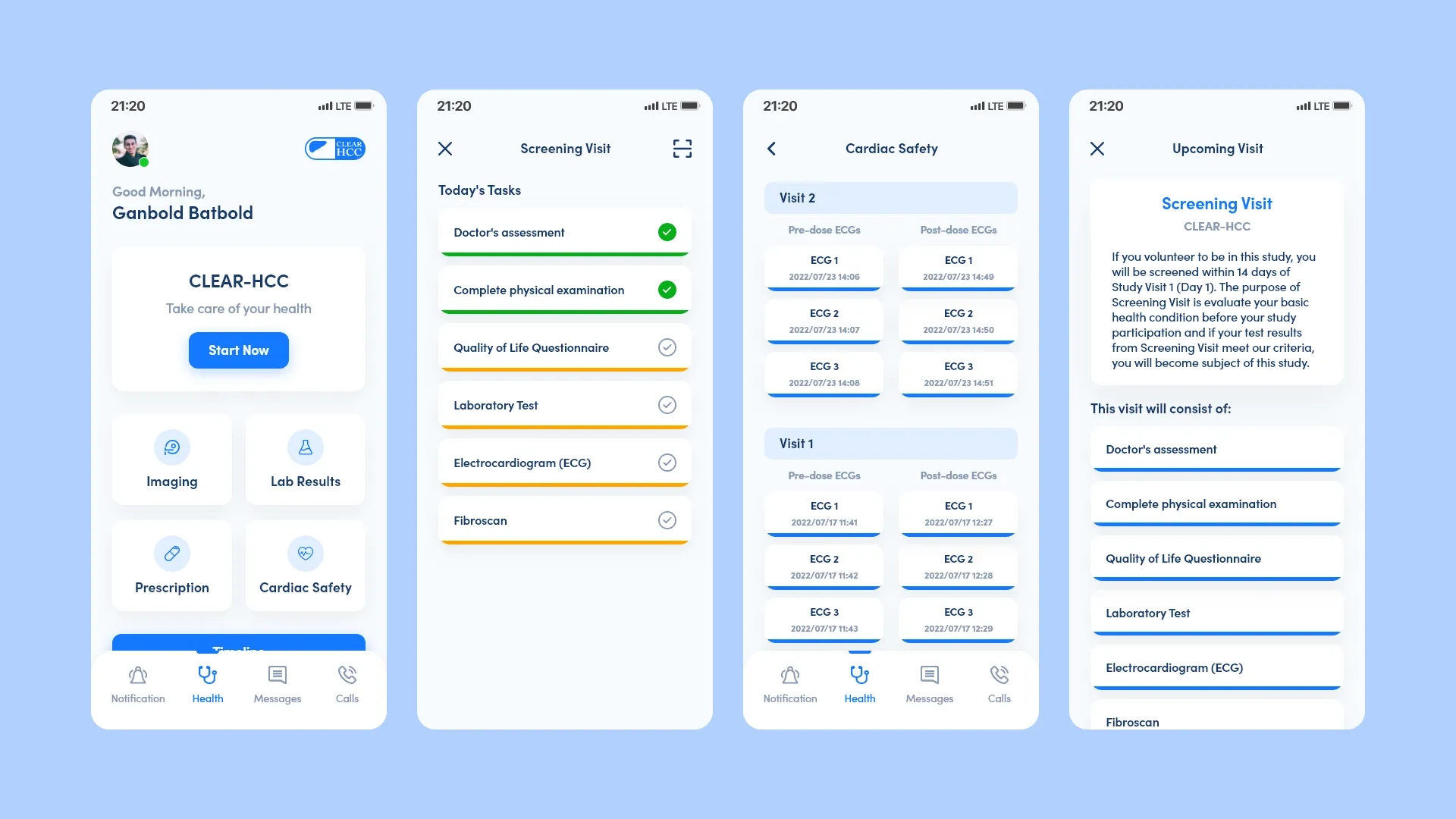
Since it was a medical app, I designed it to closely reflect the feel of a real hospital by using a strong blue as the primary color and a very light blue for the background. Other colors could have been distracting and failed to convey the right focus. The home screen was kept simple, displaying all essential features in a well-structured layout. Placing the patient’s name in the header provided reassurance that they had logged in successfully and were ready to take action.
During the screening visit, the app displayed a checklist of tasks for the day, automatically marking each one in green with a checkmark once completed. After finishing all tasks, a congratulatory screen appeared with the message, “You did it! You are the best!” to motivate and encourage patients. This small feature added a touch of happiness and relief after a long session, enhancing the overall user experience.
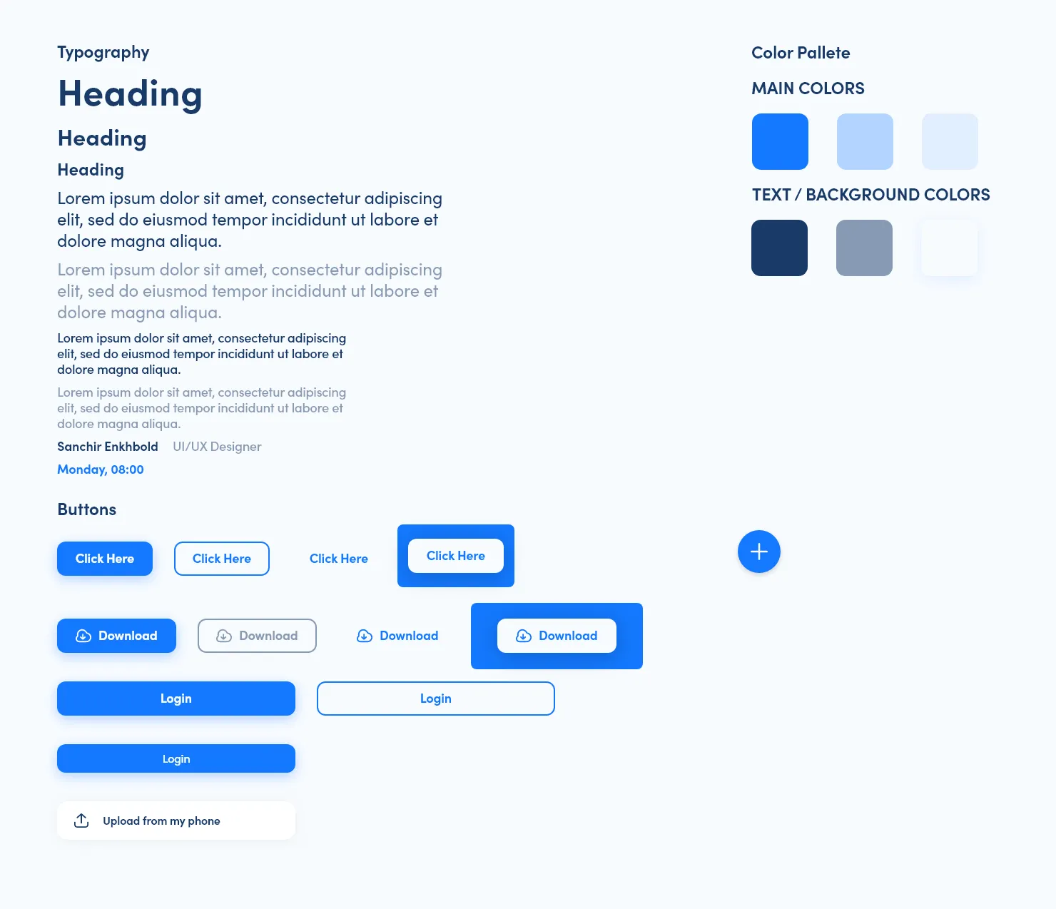
Organize your components
Organizing your components makes a huge difference in the long run. A clean structure not only helps you find things faster but also keeps your project easy to maintain. When everything is in the right place, you spend less time searching and more time building. It might feel like a small step, but it saves hours of effort as your project grows.
This is the only project I can share, but I have also worked on other medical projects. Those included a web application with extensive functionality and complex UI challenges. Unfortunately, I am unable to share those publicly. Overall, this experience taught me a great deal about designing digital products, organizing UI components, and creating low-fidelity designs. Since then, whenever I develop something, I dedicate more attention and time to the user interface and user experience to ensure the project feels practical and meaningful in real life.
Skills required for this project
If you enjoyed this project, give it some love